Launch day is when your website starts learning
Launching a new website is a big moment. After months of discovery, planning, design, development, content and testing, everything finally comes together and the new site goes live.
It's tempting to think that's the end of the project.
We see it a little differently.
A successful launch should be the culmination of a thorough design process, but it's also the point where you gain something incredibly valuable: real-world insight into how people actually use what you've created.
That doesn't diminish the importance of everything that happens before launch. Quite the opposite. Good discovery, user research and testing give a website the strongest possible foundation. What happens after launch builds on that understanding and gives you the opportunity to keep making a good website even better.
Build on a strong foundation
Before we design a website at Subism, we spend a lot of time getting to know the organisation and the people we're designing for.
Through discovery workshops, stakeholder conversations and user personas, we can understand different audiences, their motivations and what they need from the website. We look at the needs of the internal team too, from content editors and fundraisers to marketing and service teams.
That understanding informs the website architecture, user journeys and wireframes. We can test those ideas with users, challenge assumptions and make changes before moving into visual design and development.
It's an important part of the process because you don't want to launch a website simply to find out whether the fundamental thinking behind it works.
By launch, you should already have a website built on a strong understanding of its users and clear organisational goals.
But there's one thing you don't have before launch.
Thousands of real interactions with the finished website.
When real-world use reveals an opportunity
This kind of learning isn't limited to websites we've designed and built ourselves. We're often approached by organisations looking for a long-term partner to support, maintain and evolve an existing website.
When that happens, one of the first things we do is understand how the website is performing now. We talk to the team, look at user behaviour and identify where there might be friction or opportunities for improvement. From there, we can work together to prioritise changes and make a plan for how the website can evolve.
Ripple Effect is a good example.
Ripple Effect is a charity that works alongside smallholder farmers across rural East Africa, helping them grow more food, earn sustainable incomes and build secure futures.
When they came to us for ongoing website support, one of the key areas the team identified was their online shop. Alongside some UI and filtering improvements to the product listings, they were concerned about the checkout experience. The end-to-end process of purchasing a gift had become convoluted and they were seeing a significant drop-off during checkout.
Sometimes fewer steps aren't better
When we analysed the checkout journey, we could see where some of that friction was coming from.
Ripple Effect's shop isn't a straightforward ecommerce experience. Different gifts require different information and different journeys. A supporter might be purchasing a digital card, a physical card or making a donation. Depending on their choice, they may need to add a personal message, choose a quantity or image, enter an email or postal address, select a send date and then provide the usual billing and payment details.
As the website had evolved and more product types had been introduced, more options had been added to the existing checkout journey. What might seem like relatively small additions individually had collectively made the experience much more complicated for the user.
We started by breaking down all the possible products, combinations and variations, then mapping the different user flows.
There's often an assumption in ecommerce that fewer steps mean a better checkout experience. In this case, we found the opposite.
We deliberately broke the purchasing journey into clearer steps. This helped alleviate the mental load on the user by only asking them to make the decisions relevant at each stage, simplifying the experience and making it much more obvious what they needed to do next.
It also solved two other problems.
The interaction could now take place within the visible area of the page, making it much clearer when information had changed rather than requiring the user to notice something further down the screen.
And because we knew what type of product the supporter had selected in the first step, we could show them only the relevant options and form fields in the second.
One change addressing three different UX problems. A win.
Making the basket work harder
The basket was another area where looking at the real-world experience highlighted opportunities for improvement.
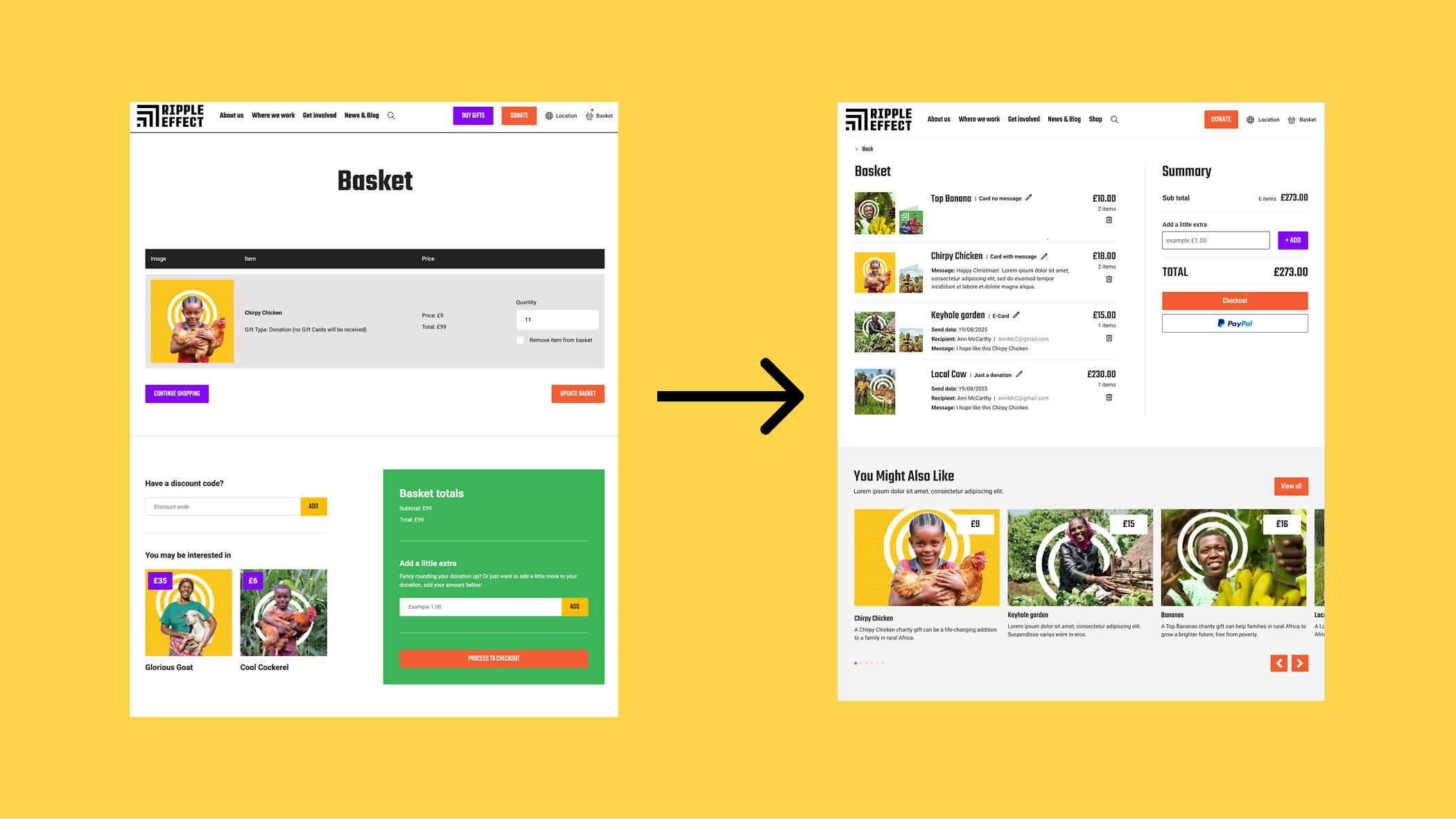
Order totals were appearing away from the main basket content, while some calls to action took people away from the checkout journey. It also wasn't immediately clear where individual items were being sent, who they were being sent to or which preferences had been selected.
We redesigned the basket so all of that information could be understood in one place. Supporters can now clearly see each item and its associated details, alongside the order summary, totals and clear calls to action to complete their purchase.
The response from the Ripple Effect team after the changes went live was really encouraging:
“The team and I are absolutely delighted with the new setup. This will undoubtedly make a significant difference for our income over the next three months and beyond.”
They also told us they'd already seen a significant purchase come through, giving the team some early reassurance that the new experience was working well for supporters.
None of these changes required rebuilding the website. They came from understanding how an existing website had evolved, looking at how people were actually using it and identifying where focused improvements could remove friction.
It's a good example of why we don't see a website as something that simply gets launched and maintained. Whether we've built it ourselves or inherited it from another agency, there's always an opportunity to keep learning from it and make it better.
Listen to the team as well as the data
Analytics only tells part of the story.
The people managing the website every day are another incredibly useful source of information.
A content editor might discover that a particular type of page is becoming increasingly important. A fundraising team might notice the same question coming from supporters. A service team might find that people regularly call because they can't find a particular piece of information.
Individually, these might seem like small observations. Collectively, they can tell you a lot about how a website is performing.
It's why we think ongoing conversations with the people inside an organisation are just as important after launch as they are during discovery. They're often the first people to notice when the needs of an audience begin to change.
Small changes can make a big difference
Continuous improvement doesn't have to mean constantly redesigning your website.
Often, it's the smaller changes that make the biggest difference.
It might be simplifying a user journey, changing the hierarchy of a page, making a call to action clearer, improving navigation or introducing a component that content editors increasingly need.
Some improvements will come from analytics. Others will come from user feedback, accessibility testing, changes in search behaviour or simply conversations with the team.
The important thing is that those decisions are informed by evidence rather than personal preference.
A website shouldn't slowly become outdated while everyone waits for the next redesign. It should evolve alongside the organisation it represents.
Organisations don't stand still
This is particularly important for charities and purpose-led organisations.
Services change. Campaigns come and go. Fundraising evolves. New programmes launch. Audiences change, and the way people interact with organisations changes too.
Technology moves on as well.
A website that perfectly reflected an organisation on launch day won't necessarily reflect that same organisation three years later if nothing changes.
Historically, the answer has often been a major redesign every few years. Everything is reconsidered, rebuilt and relaunched, then the cycle starts again.
We think there's a better way.
Rather than allowing a website to gradually fall behind, we prefer to continually learn from it and evolve it.
That doesn't mean change for the sake of change. Sometimes the evidence tells you something is working perfectly well and should be left alone.
The point is to keep asking questions.
A successful launch isn't the point where you stop making decisions about your website. It's the point where you have a whole new set of information to help you make the next ones.
Latest Insights
More news, views and insights from Subism HQ



Related Projects
If you were interested in this article you may also like these projects:
